In this final post about all the upgrades we’ve been making to Combat Cards (here are parts one and two) I wanted to look at an area we all take for granted when playing – the game’s menu screens.
Important
I think it’s fair to admit that a look at a game’s menus doesn’t sound enormously exciting, but good menu design can vastly improve a game, and – perhaps even more so – bad menus can ruin an otherwise great game.
A game’s menu (or as we call it, User Interface) has one simple job – to let you give whichever command you like in as few steps as possible – and the more often you want to give that command, the fewer steps there should be to do it. That’s why from loading Combat Cards it only takes two commands to get into a battle – tap War, then tap Deploy.
UX
Ensuring a game is easy to use is called UX – User Experience. This is more than just ensuring players being able to find what they’re looking for, It’s a blend of art and design which is about helping players understand what they want to do and how to do it.
Look at it this way: As a player, you think ‘I want to upgrade my Aximillion card’ – but you don’t want to have to think about how you can do that. Good User Interface design means you’ll be able to do that upgrade as easily as possible, but good User Experience means you know that you have the resources to do it, how to do it, and what the rewards for doing so will be.
These two areas affect everything you do in a game, so (and I’ve just realised this is the longest, most roundabout intro to a blog post, ever) that’s why we’ve been upgrading the game’s menus.
Floaty
While our new menus work much like the game’s Mark 1 version, the new ‘floating’ UI style means the menus are built to make it much easier for us to change and improve them over time. It also means we’ll be able to make the game run on a wider variety of different device screen sizes and shapes.
Basically, we had to put the work in now so that we can more easily support and grow the game for years to come.
Battlefields
I also briefly wanted to look at the new battlefields – the scenes you see behind the battles you fight.
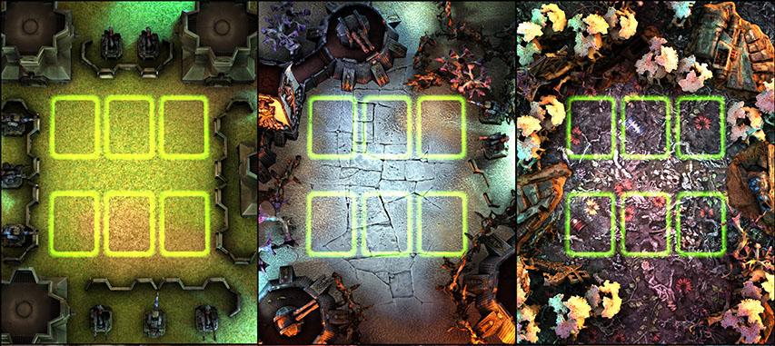
Samples of our cool new battlefields!
We’ve jumped from a single battlefield to eight, allowing us to have one per faction. At the moment the differences are purely cosmetic, but having different battlefields will allow us to look at adding gameplay differences between them in the future (note that I’m not promising this feature – we have exciting ideas here, but there’s lots of other features to add before then!).
But, even with only graphical differences, the new battlefields are still cool. They add variety, but also make the game feel more ‘Warhammer 40,000’, because there’s an incredible variety of planets within the Imperium. Also, when you play tabletop 40K, the scenery is different every battle – and as we’ve scanned that same tabletop scenery to make our new battlefields, it gives the game an feeling of authenticity.
You can read more about how and why we scanned in physical scenery for our battlefields here. This time we outsourced the 3D scanning to experts, then positioned the resulting assets on the battlefields, added lighting and, for that final touch, made sure the floors of each battlefield are photo’s of Moon Base Klaisus, Sector Imperialis and the like).
Conclusion
Thanks for reading this and the previous looks at the improvements we’ve been making. I guess these may not be the most exciting blog posts, but I wanted to give you guys an insight into why it’s taken so long for us to release worldwide.
As ever you can get in touch with questions or feedback through our Facebook page or [email protected].
Thanks,
Stu
“That’s why from loading Combat Cards it only takes two commands to get into a battle – tap War, then tap Deploy”
….but that’s not what is happening with this current version. Right now we click “War”, Then “Deploy”, then “Onwards”
Generally I agree with the goals stated above, good UI is absolutely critical to the success of a game. But I feel that these recent changes have actually added steps where you didn’t have them before AND the animations are slower. This has resulted in a double whammy of adding time to each game.
the picture of the three battlefields in this post…. the far right one is heavily distracting from the cards. it’s too much colour and detail immediately surrounding the cards on top.
Thanks for the feedback – we’ll be ‘tightening up’ the new version over the next few weeks ahead of worldwide launch, so it’s always useful to hear where the sticking points are for players. Also, you’re not the only person to mention the colours of that particular battlefield, so I’ll pass the feedback on to our artists!
The new menus big out a lot, lots of problems with opacity so I hope that gets fixed.
The backgrounds are a nice touch but ruin the clarity of the game. With the current campaign forced to play tyranids , if I get the 3rd background in your image here it’s really uneasy on the eyes with all the same colors everywhere.
Also I would like to add that the game got a metric ton slower on my device since last update. Don’t know if you moved from unreal to unity but the main menu is hell to navigate and I’ve lost multiple cell point thingies because of the laggy clicking there. I’m on a Samsung s8+ so not a really slow model either.
I’ve really considered taking a break after this last issue, but I really want my wraith lord to be honest.
Hi there, our apologies for the issues and slow-down with the new version, and we’ll be working to fix them as quickly as possible over the next few weeks.
I’ll also pass your feedback on the battlefield colours over to our art team.